BRANDING DESIGN MARIENBURG CASTLE
Redesign of the Corporate Design of Marienburg Castle in Hildesheim, Nordstemmen where amazon prime hit-series 'Maxton Hall' was filmed.
SUGGESTION OF A RE-BRANDING FOR MARIENBURG CASTLE
In the summer term of 2021, the administration of Marienburg Castle turned to the HAWK University of Applied Sciences and Arts as part of the “Corporate Design Basics” project. Under the creative direction of Prof. Dipl.-Des. Dominika Hasse, we were commissioned to develop comprehensive concepts for the complete redesign of the castle's corporate identity.
The aim of this redesign was to visually unite the two brands operating under the umbrella of the castle - the “Schloss Marienburg Foundation” and the tenants of the castle, who run the location as “Schloss Marienburg” - while at the same time creating a clear separation. The challenge was to create a corporate identity that equally represents the foundation as the holder of the historical and cultural values of the castle and the tenants as the operators of the event and catering area.
As part of the project, we created comprehensive design concepts that included both the development of a common symbolic world and the design of a uniform signage system for the entire castle grounds. In addition, we designed the websites of both parties to ensure a consistent online presence.
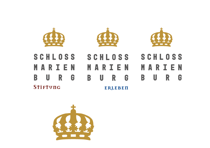
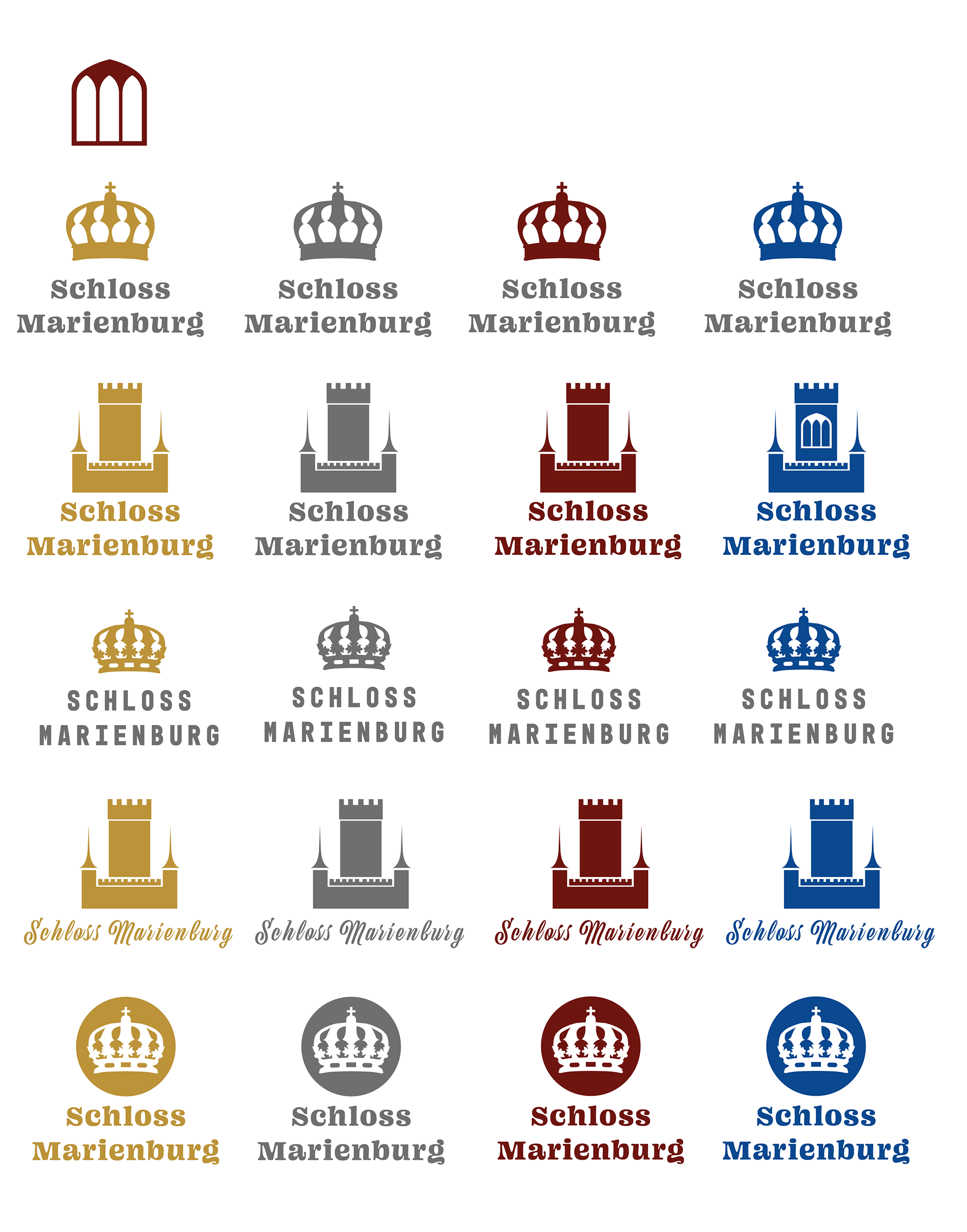
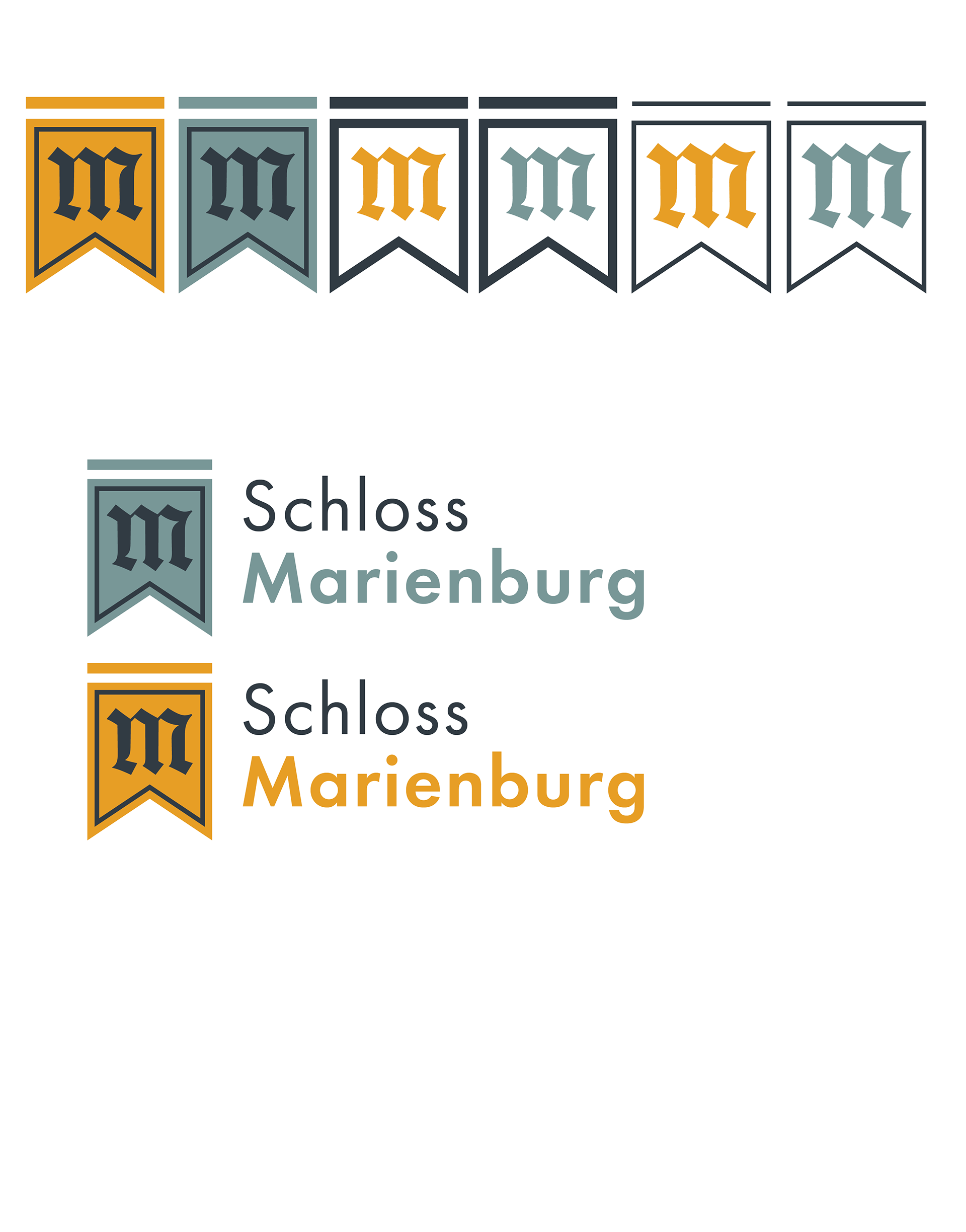
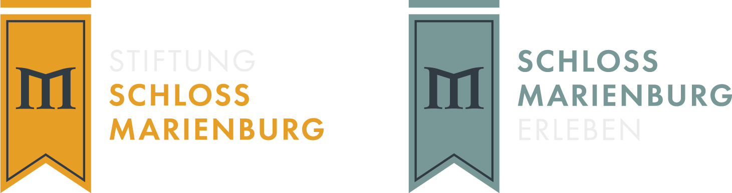
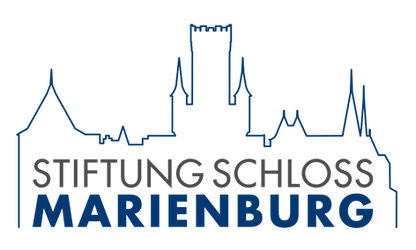
In my specific concept, both parties have the same basic logo, but this is varied with different lettering and color schemes to emphasize their respective identities. The yellow tone serves as a contrasting color for the “Marienburg Castle Foundation”, which is responsible for the historical exhibitions and cultural programs. The light shade of blue, on the other hand, is used as a contrasting color for the tenants who run the gastronomic offerings and the event location.
This targeted color and design strategy achieves a clear visual differentiation that nevertheless creates a harmonious overall identity for Marienburg Castle. This differentiated but uniform presentation strengthens the brand identity of both parties and contributes to a coherent and professional appearance.
The aim of this redesign was to visually unite the two brands operating under the umbrella of the castle - the “Schloss Marienburg Foundation” and the tenants of the castle, who run the location as “Schloss Marienburg” - while at the same time creating a clear separation. The challenge was to create a corporate identity that equally represents the foundation as the holder of the historical and cultural values of the castle and the tenants as the operators of the event and catering area.
As part of the project, we created comprehensive design concepts that included both the development of a common symbolic world and the design of a uniform signage system for the entire castle grounds. In addition, we designed the websites of both parties to ensure a consistent online presence.
In my specific concept, both parties have the same basic logo, but this is varied with different lettering and color schemes to emphasize their respective identities. The yellow tone serves as a contrasting color for the “Marienburg Castle Foundation”, which is responsible for the historical exhibitions and cultural programs. The light shade of blue, on the other hand, is used as a contrasting color for the tenants who run the gastronomic offerings and the event location.
This targeted color and design strategy achieves a clear visual differentiation that nevertheless creates a harmonious overall identity for Marienburg Castle. This differentiated but uniform presentation strengthens the brand identity of both parties and contributes to a coherent and professional appearance.
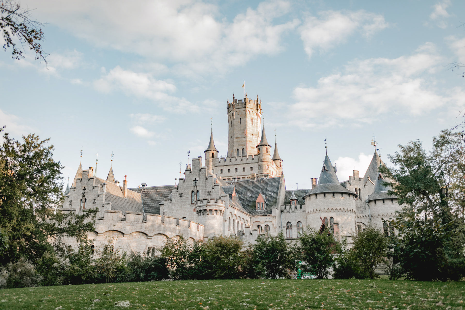
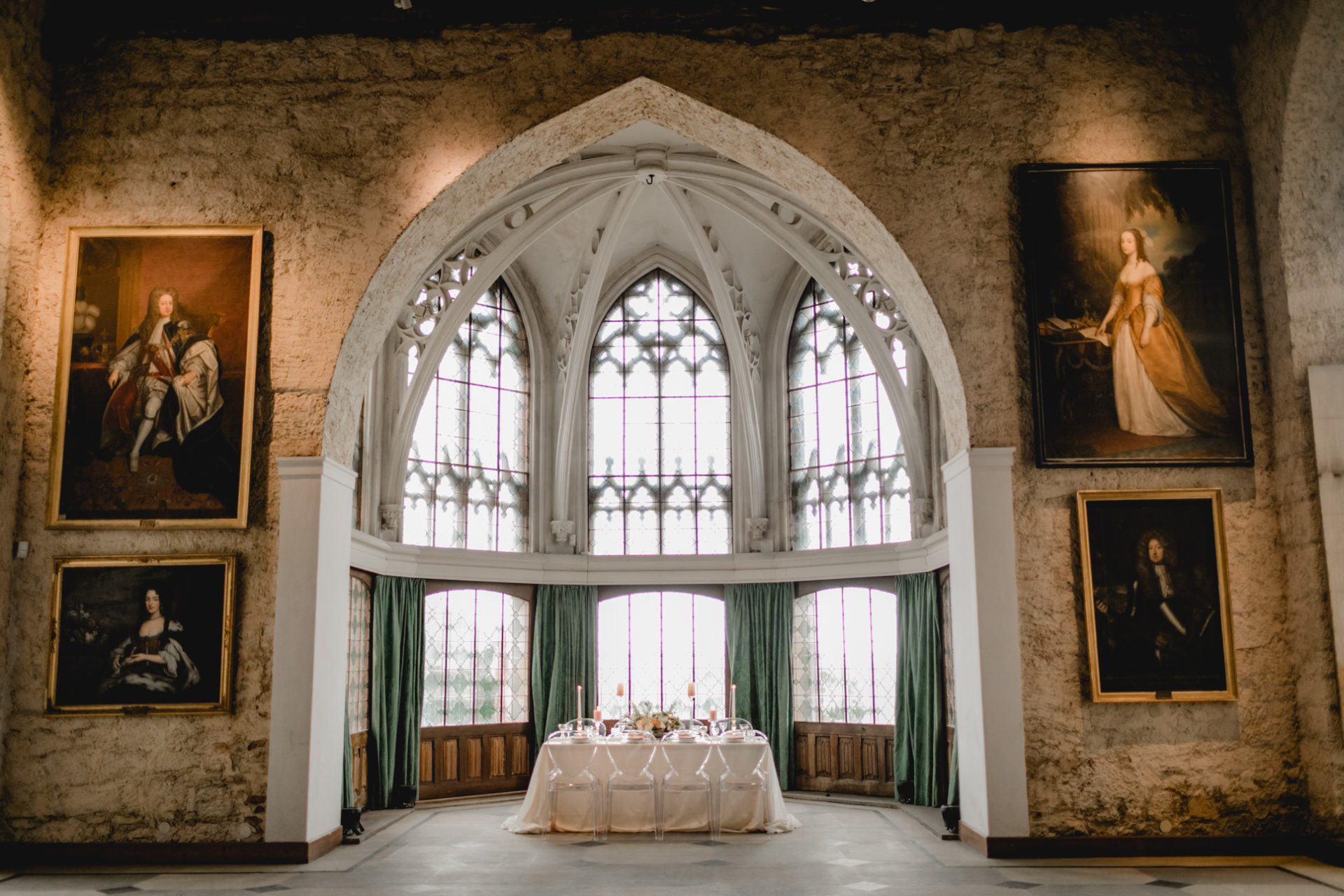
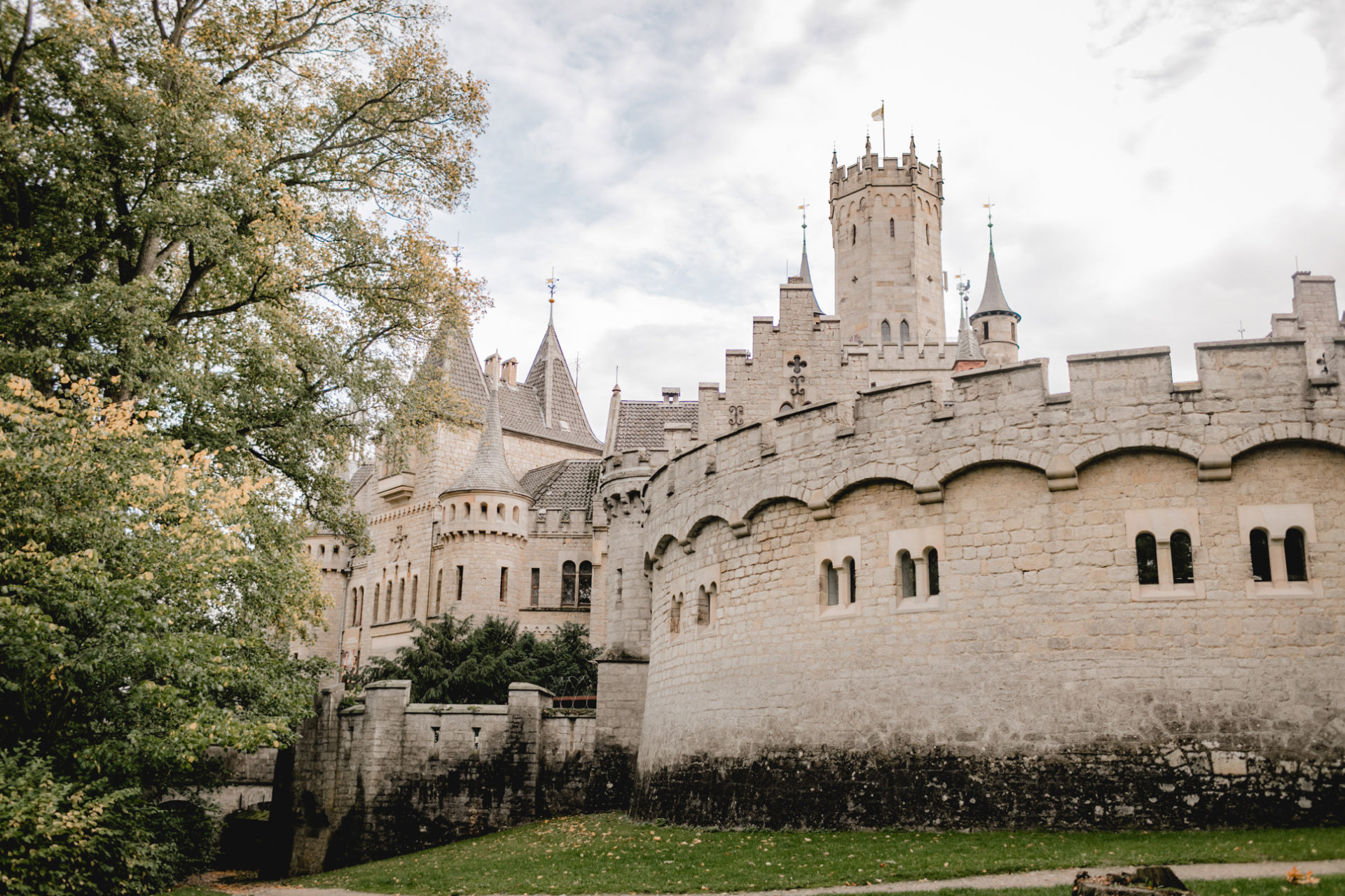
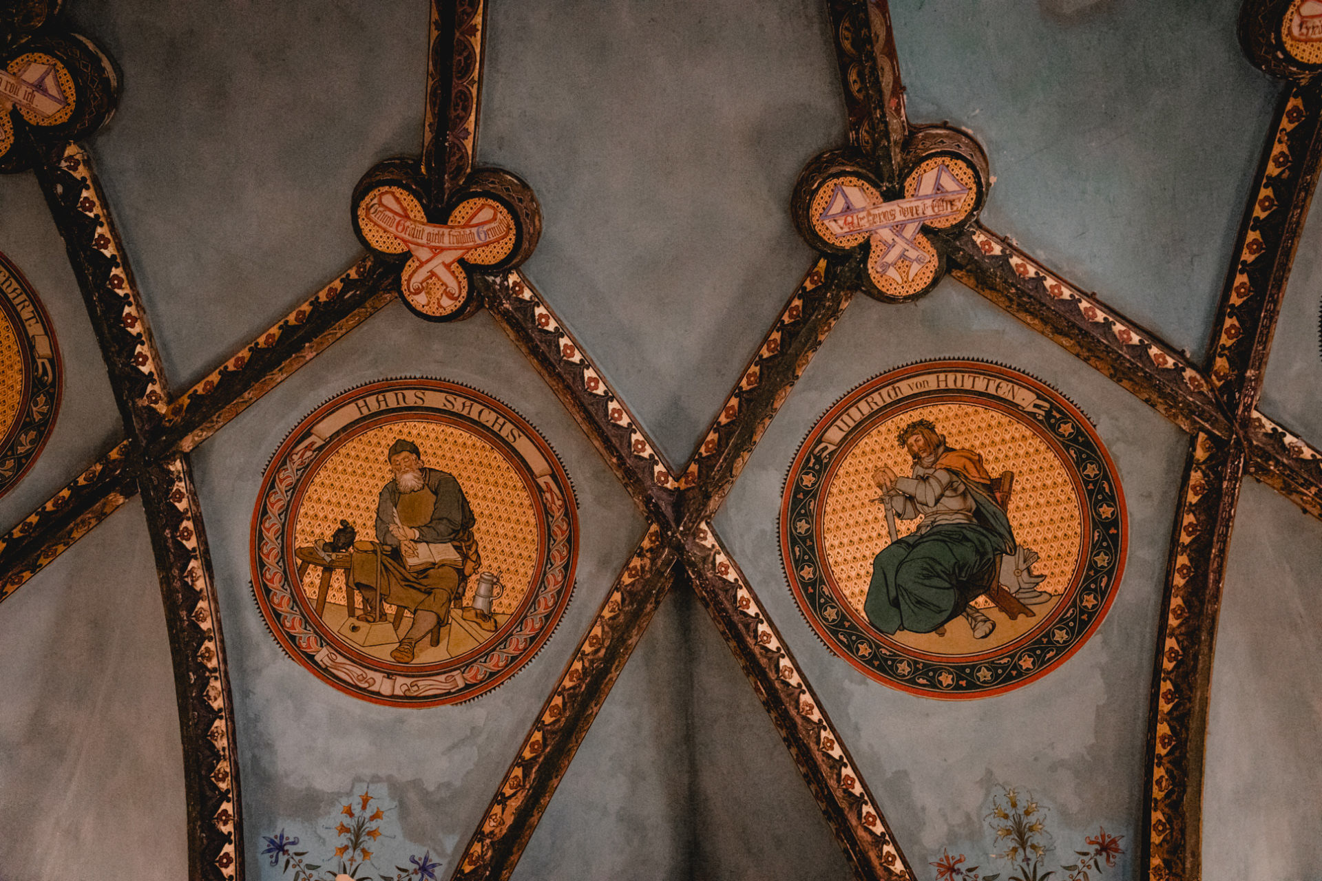
IMPRESSIONS FROM MARIENBURG CASTLE
Picturecredits: www.dianafrohmueller.com www.schloss-marienburg.de
Picturecredits: www.dianafrohmueller.com www.schloss-marienburg.de
Picturecredits: www.dianafrohmueller.com www.schloss-marienburg.de
Picturecredits: www.dianafrohmueller.com www.schloss-marienburg.de
Picturecredits: www.dianafrohmueller.com www.schloss-marienburg.de
MY RE-DESIGN SUGGESTION
Before the redesign, the Castle's two entities—the Foundation and the Castle Location—lacked cohesion. Without prior knowledge, it was difficult to tell they were part of the same establishment, aside from sharing the name.
A key objective, as communicated by the Castle's representative, was to create logos that were more cohesive while maintaining their individuality for easy distinction.
Initially, I considered creating a mother brand with two daughter brands representing each party. However, this idea was dismissed as unnecessary and impractical. Instead, I opted to develop a corporate identity that functions seamlessly both together and independently.
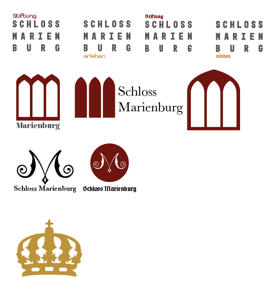
For the logo's shape, I drew inspiration from the banners and flags displayed in the castle, which historically showcased family emblems and symbols of status. These elements functioned as the logos of their time, so I decided to base the new logo design on this historical connection.
Below are the old logos for comparison with the redesigned versions:
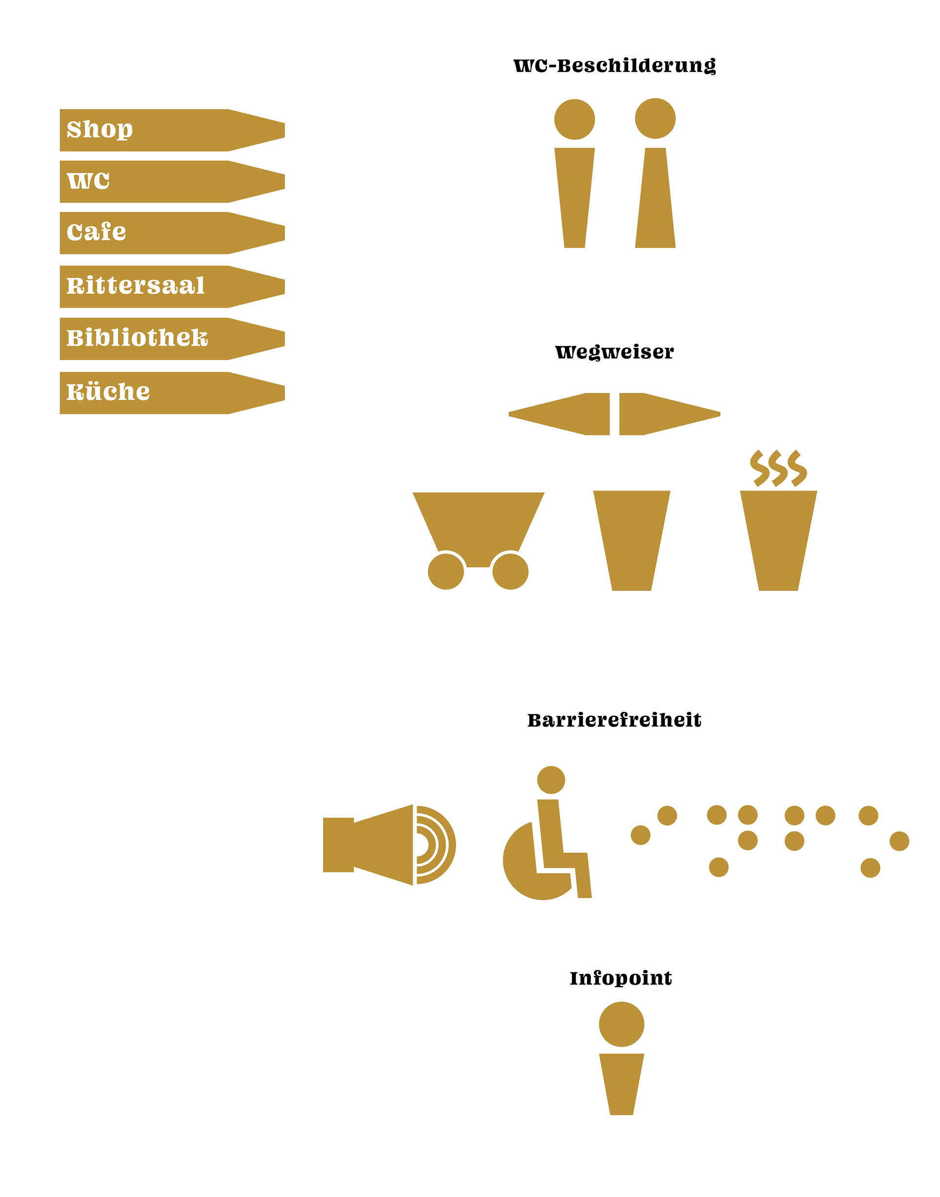
ICONOGRAPHY AND ORIENTATION SYSTEM
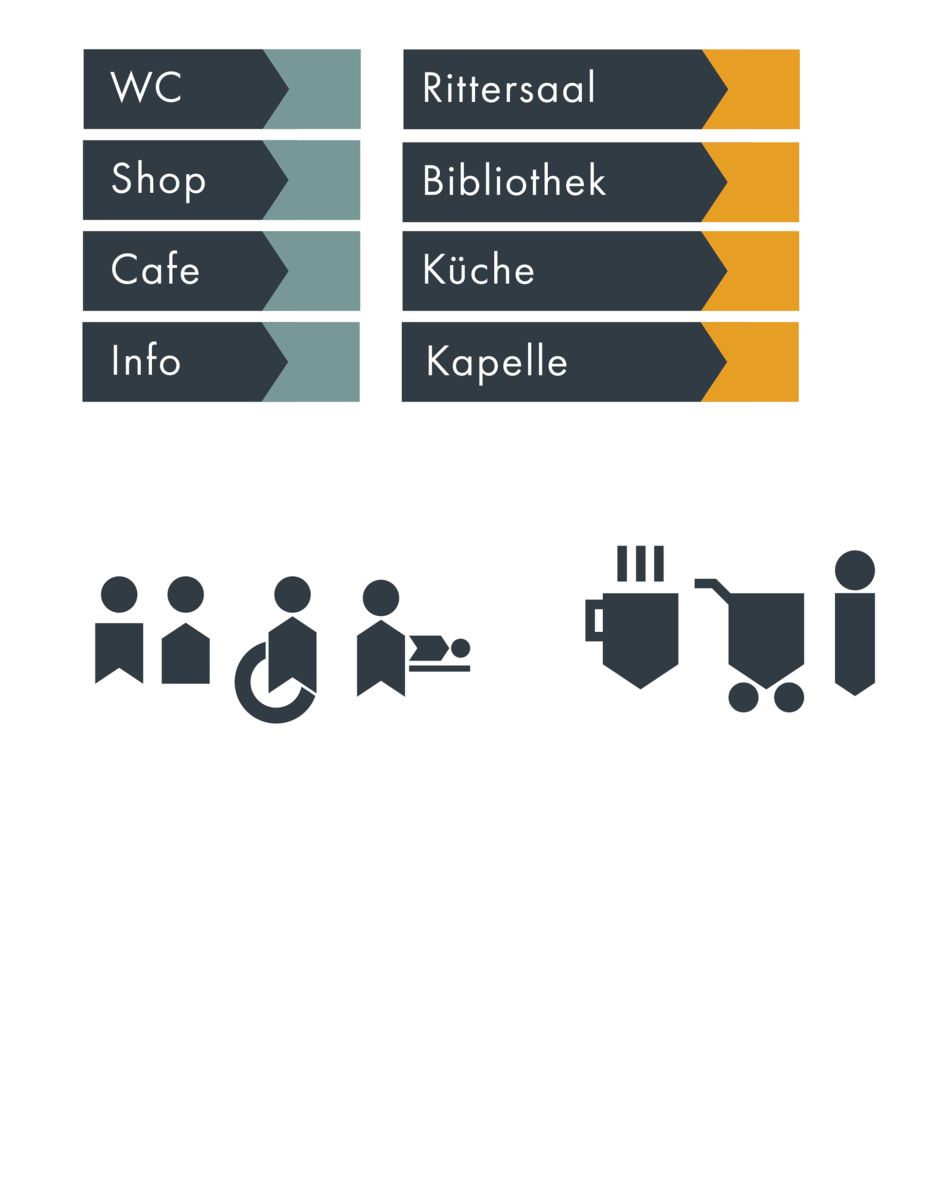
The iconography and signage system is designed to match the shape of the logo, making it easy to recognize and visually appealing. This design is inspired by the banners and flags used during the time the castle was built, which displayed family emblems and symbols of rank.
Visitors will quickly notice the different colors as they explore the castle and its grounds, which helps them understand the system in place. Yellow signs indicate parts of the exhibition, guiding visitors to displays and historical artifacts. Blue signs point to amenities like restrooms.
To help people who have difficulty distinguishing colors, the signs also come in different lengths. Short signs indicate amenities, while longer signs point to exhibition areas. This approach ensures that all visitors can easily find their way around the castle.
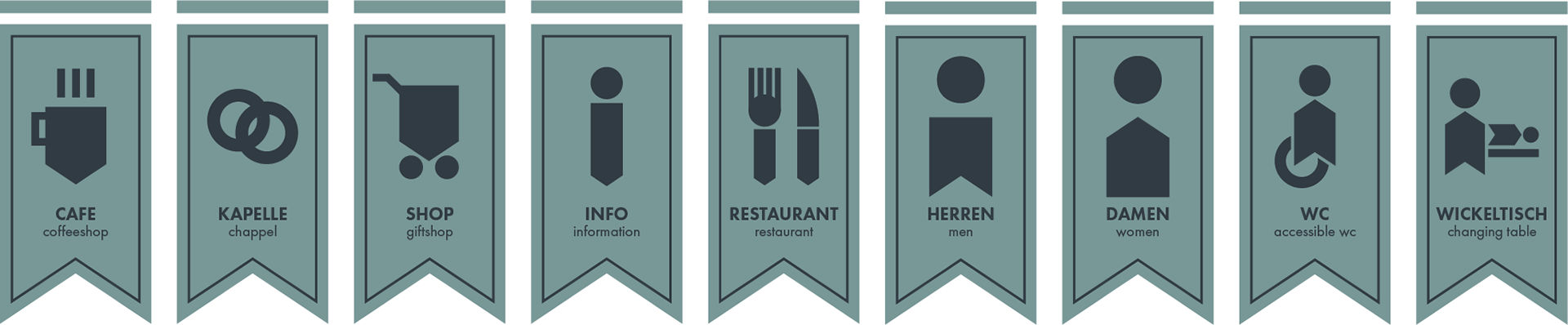
Signage for ammenities

long, yellow signs for the Exhibition - short, blue signs for the ammenities
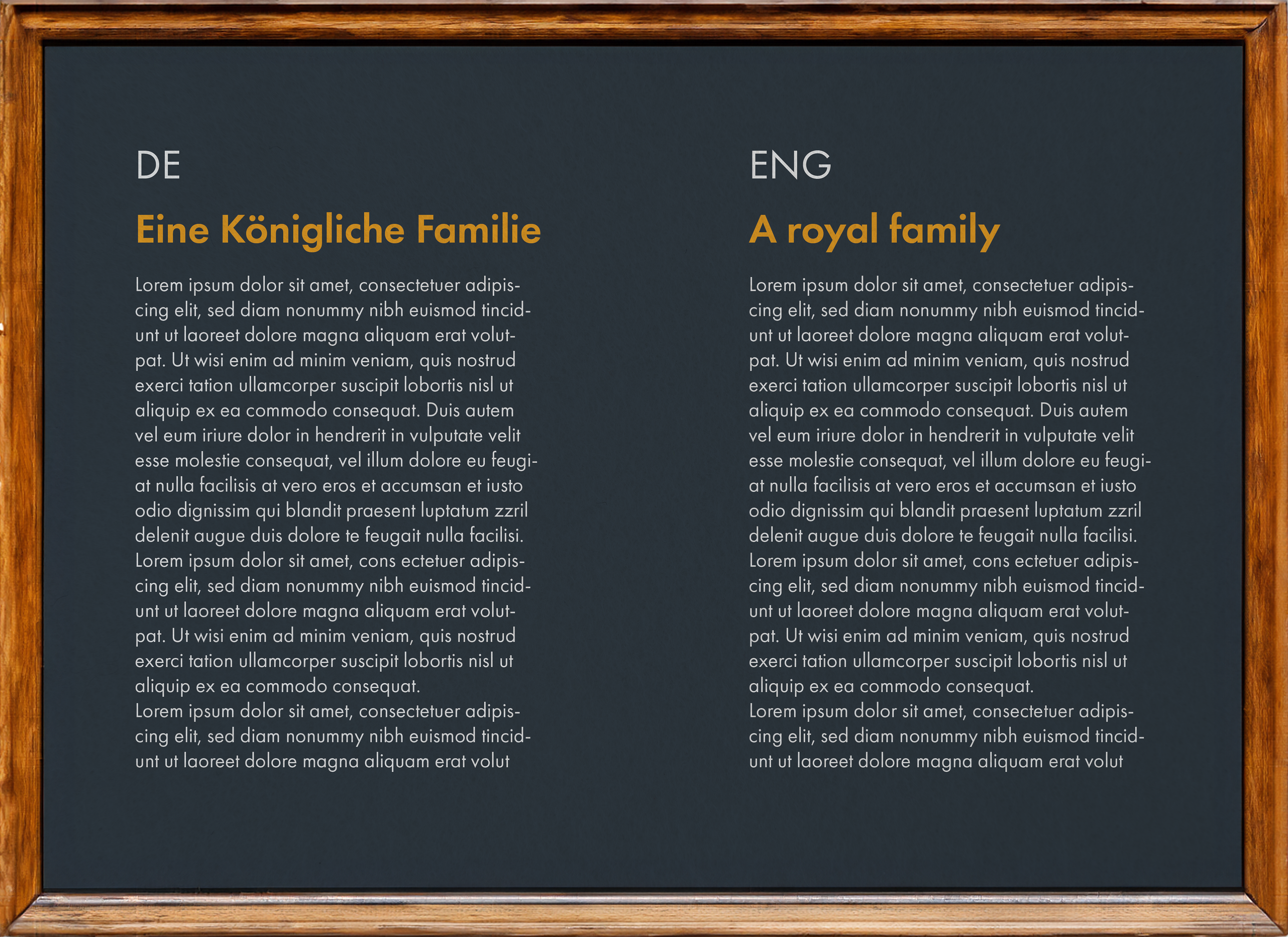
Information Plaques in the pre-existing rustic-oak frames
WEBSITE CONCEPT
My concept for a website solution proposed a unified yet distinct structure consisting of two clearly separated sections under the same domain. These sections aim to eliminate confusion by clearly directing visitors to where they can for example, buy tickets and where they can find information about the exhibition and its foundation.
Currently, the existing websites operate independently without acknowledging each other, resulting in user confusion.
To address this issue, my strategy involves integrating both websites into one cohesive platform. Each sub-site will feature its partys unique contrast-color to clearly seperate the Location and the Foundation. This design approach not only enhances visual clarity but also facilitates effortless navigation between the two.
By consolidating the websites under a unified domain and using visual cues to keep a seperation, I aim to provide a streamlined and intuitive user experience. Visitors will easily discern which section pertains to venue details and which focuses on historical aspects curated by the foundation.
This approach not only resolves the current disconnection between the two partys but also reinforces their complementary roles within Marienburg Castle.
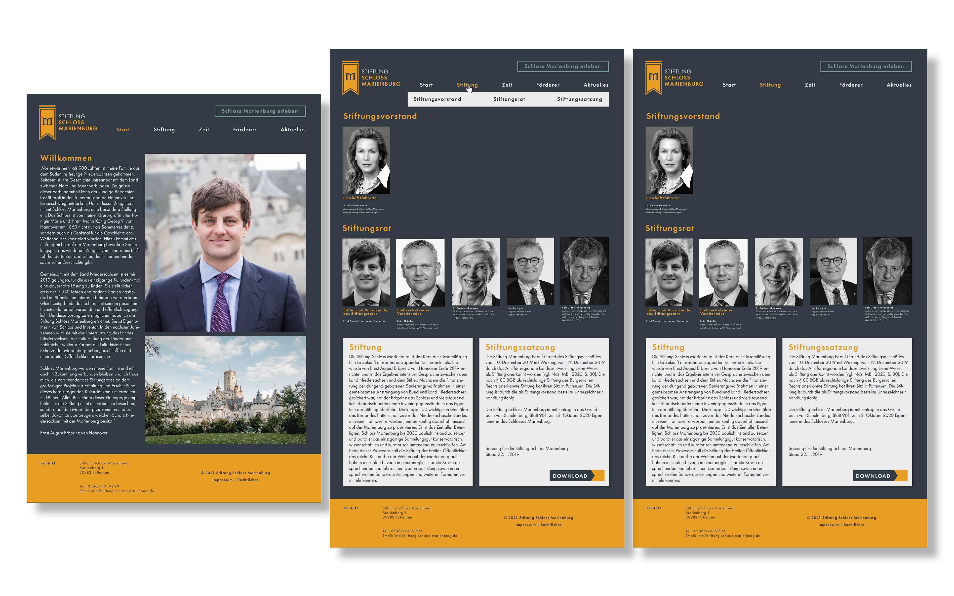
Foundation Website
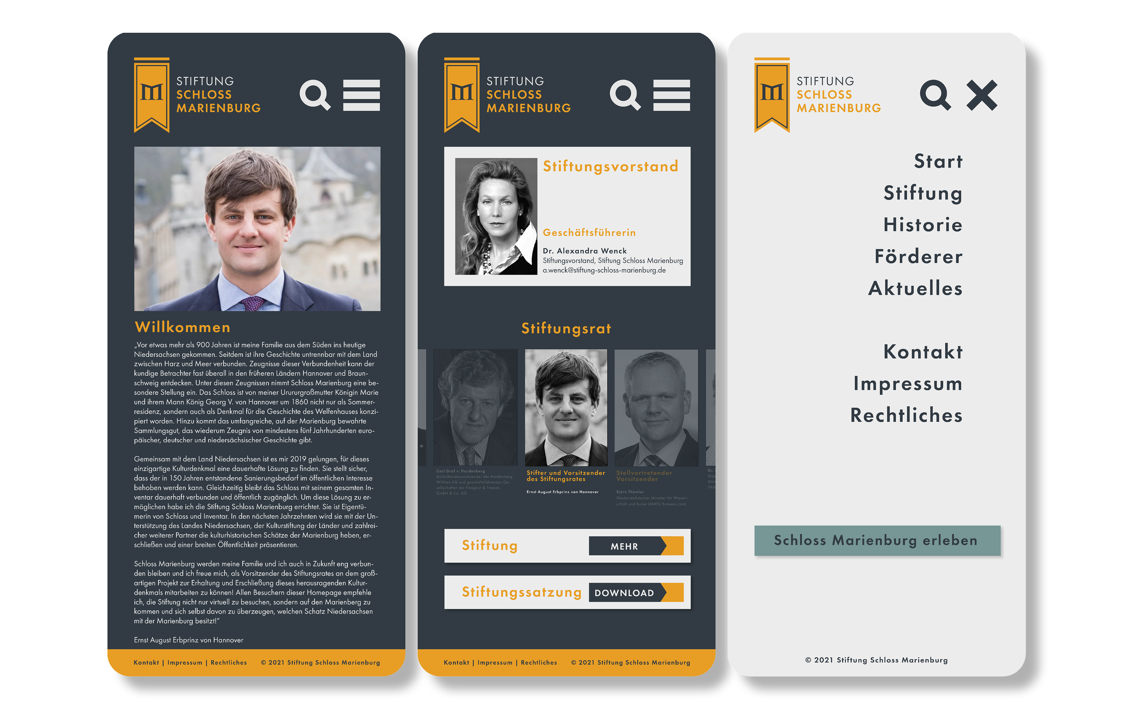
Foundation Website Mobile Version
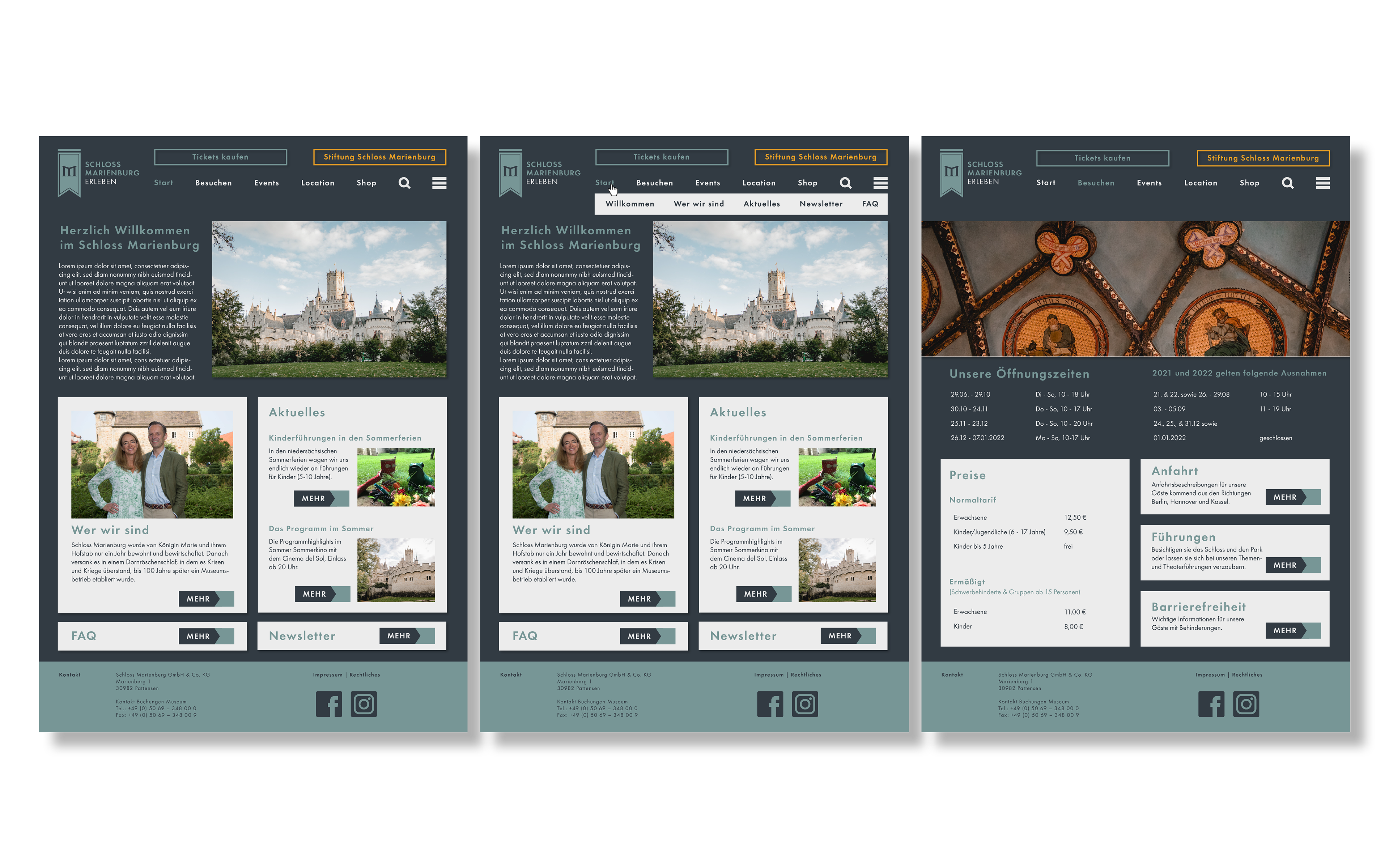
Location Website
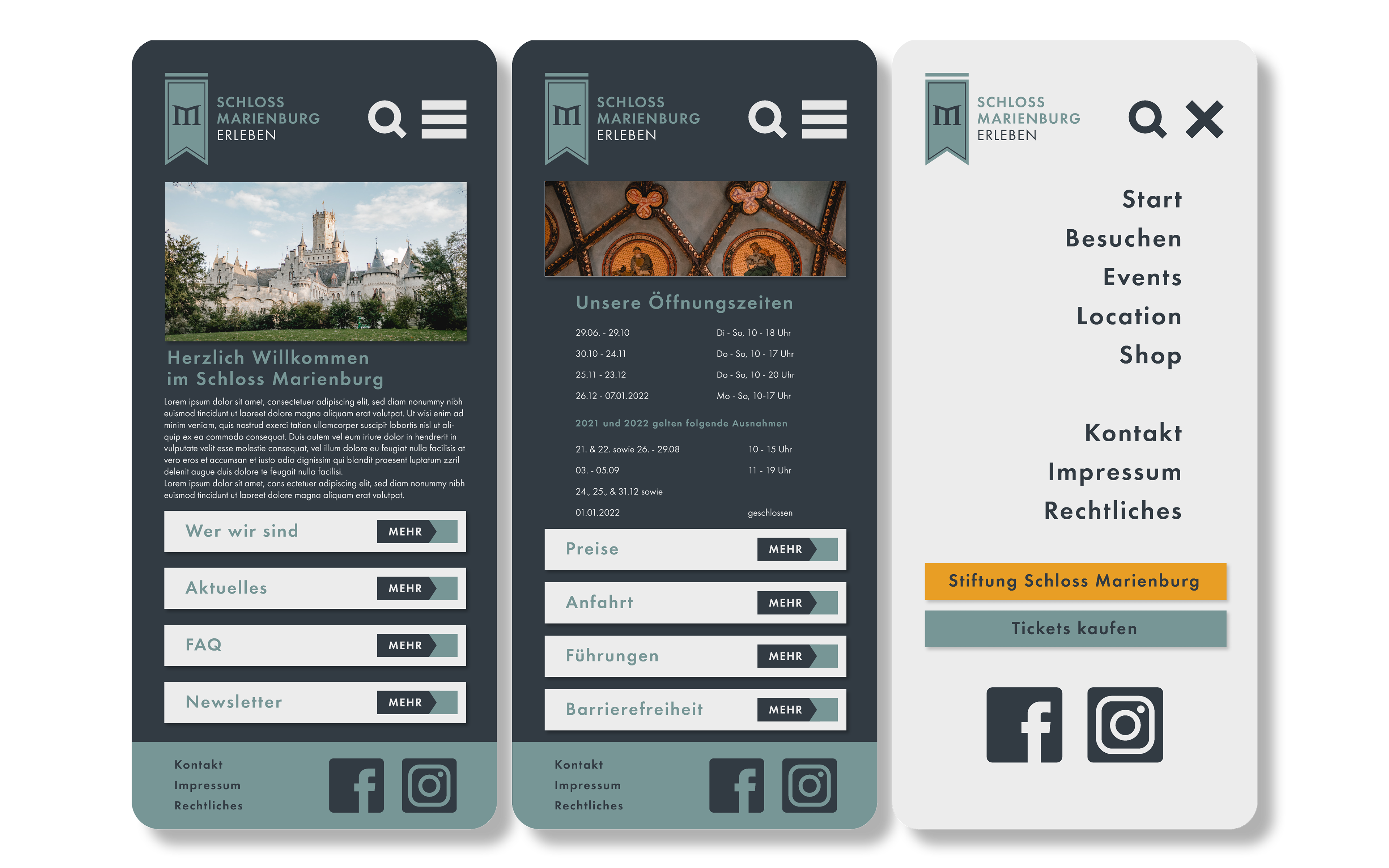
Location Website Mobile Version
BUSINESS CARDS, FLYERS AND POSTERS
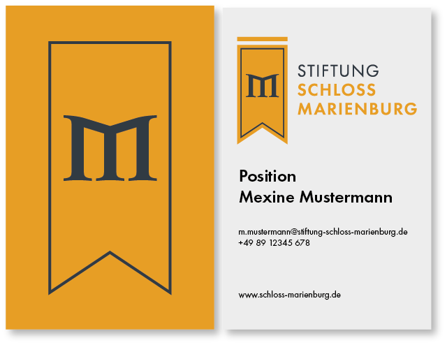
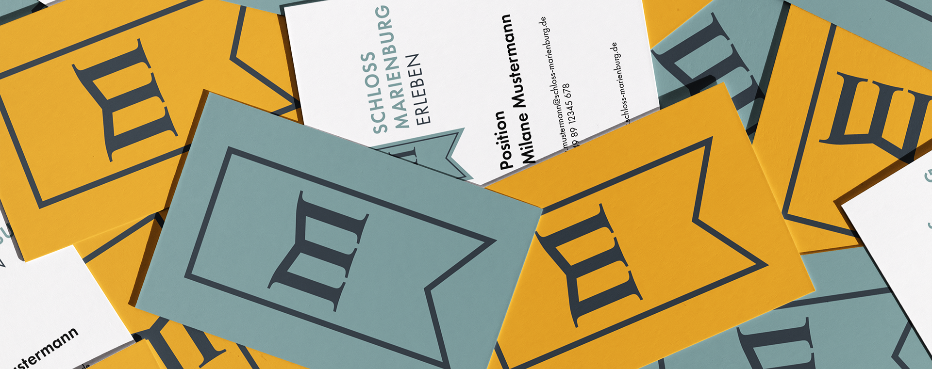
Business Card for Foundation Members
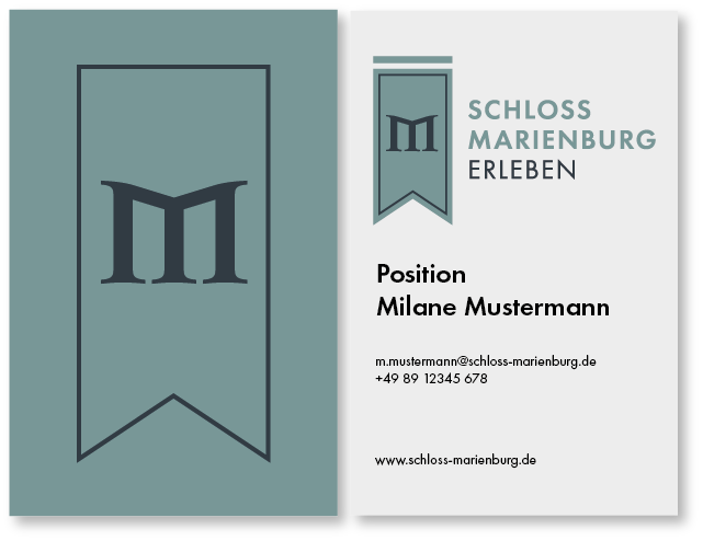
Business Card for Location Staff
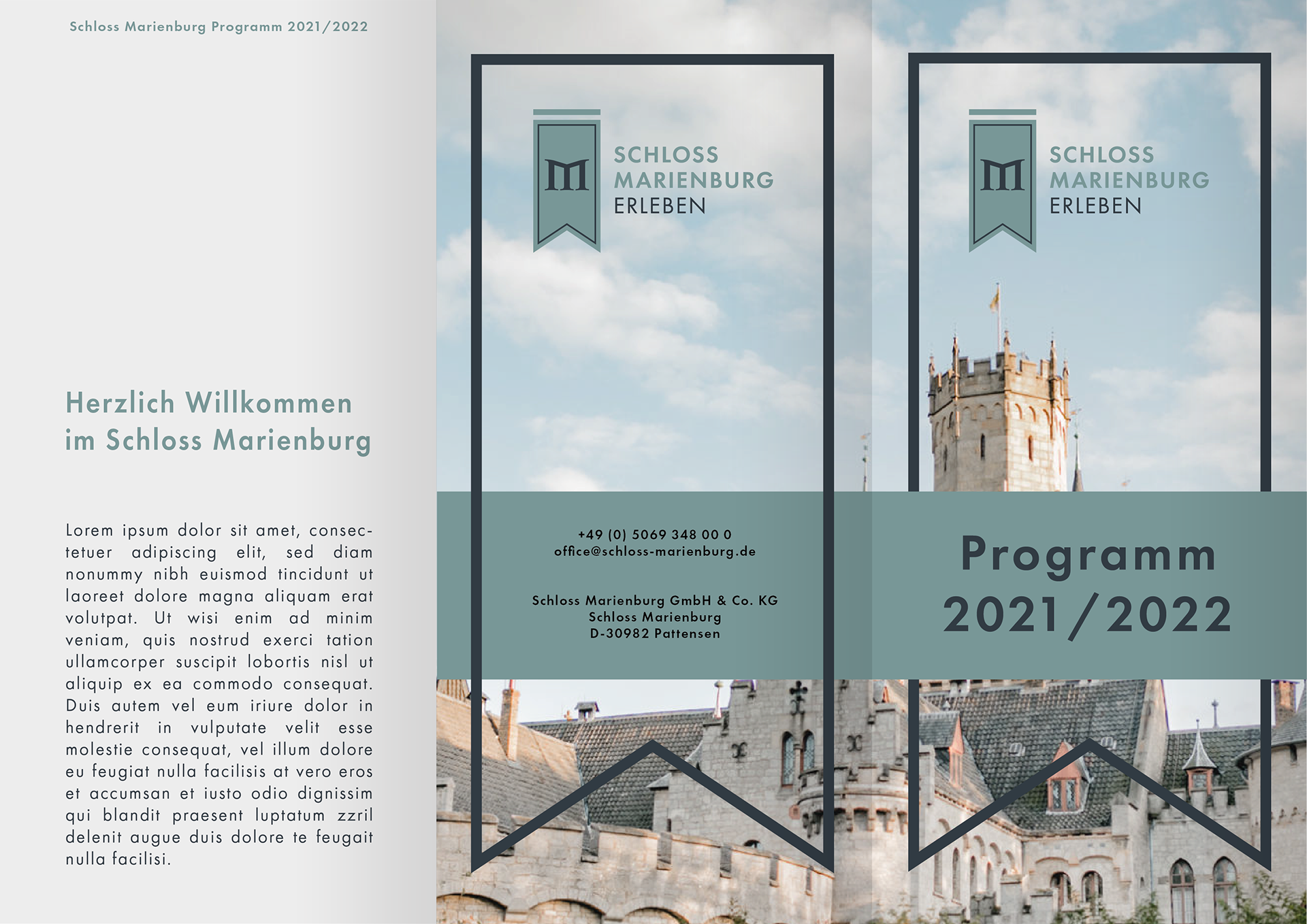
Program-Flyer
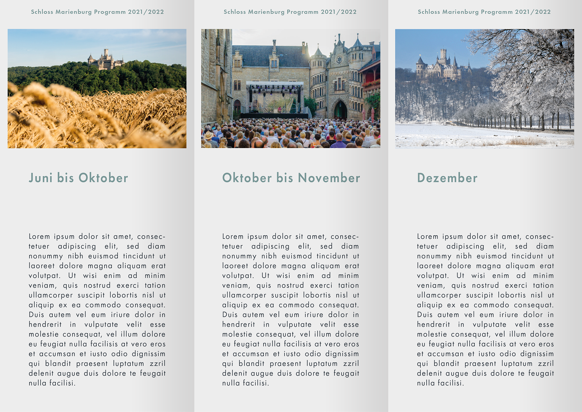
Program-Flyer
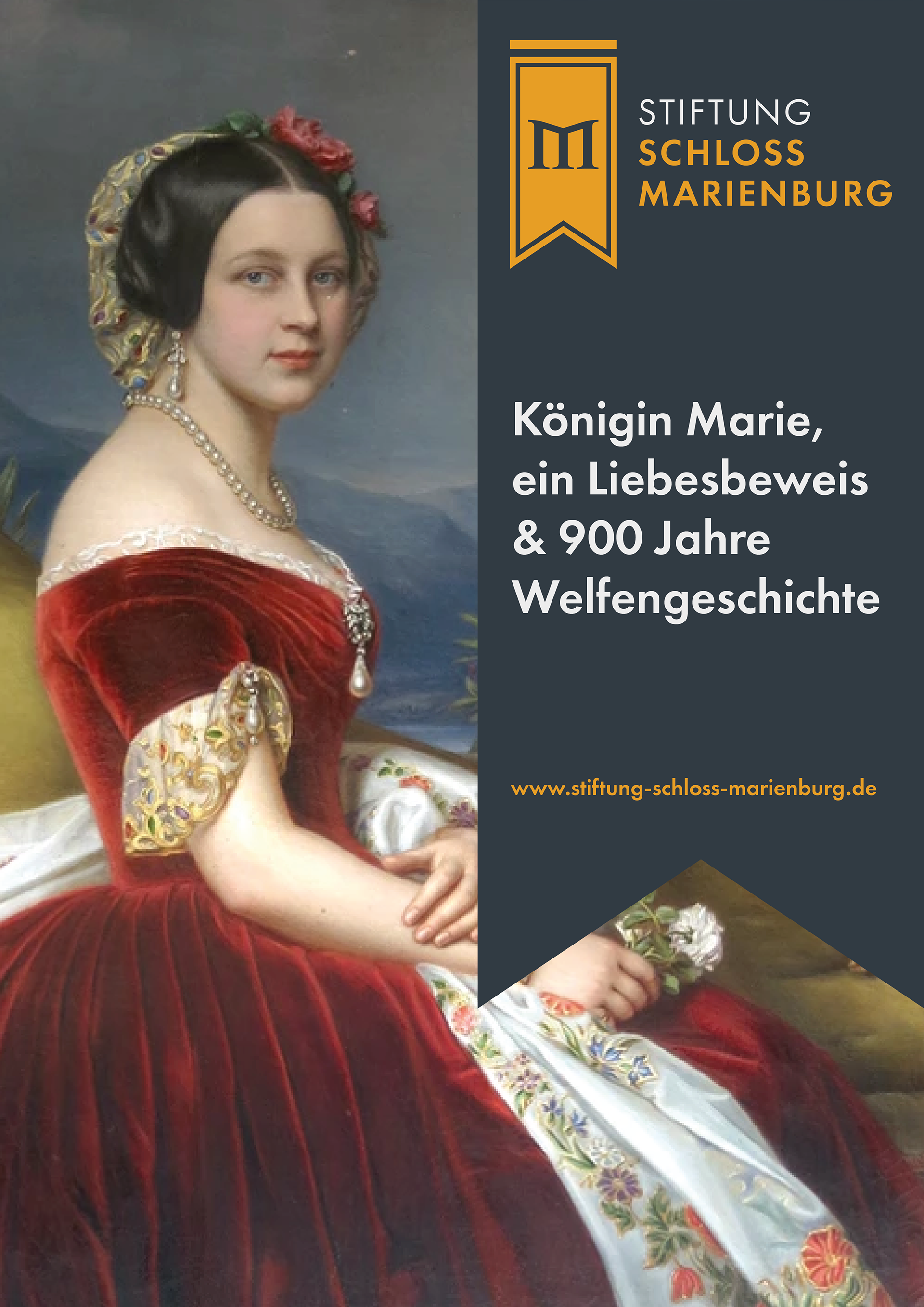
Poster in Foundation Colors focused on the History 'Queen Marie, a token of Love and 900 Years of Welfen-History'
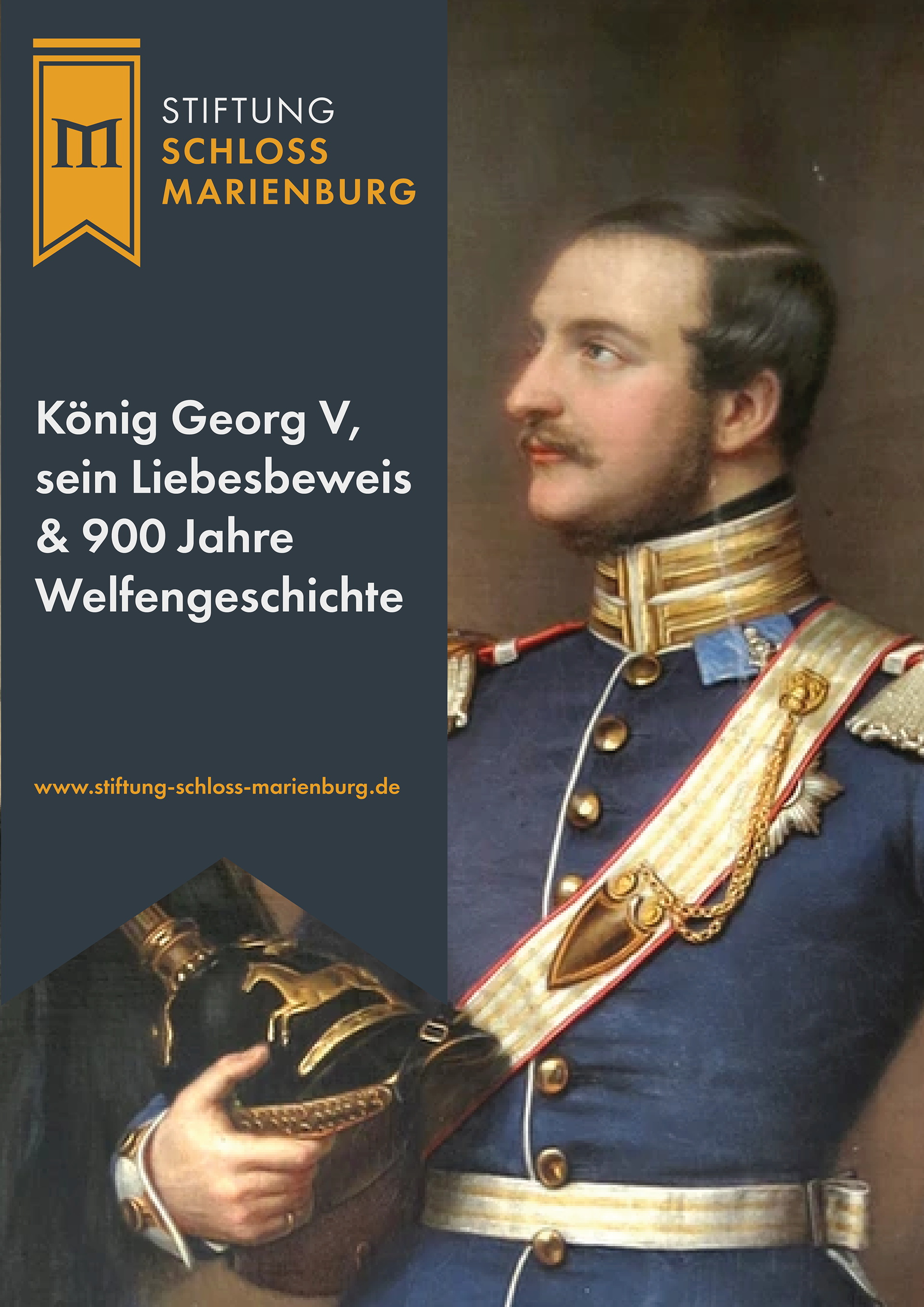
Poster in Foundation Colors focused on the History 'King Georg V, his token of Love & 900 Years of Welfen-History'
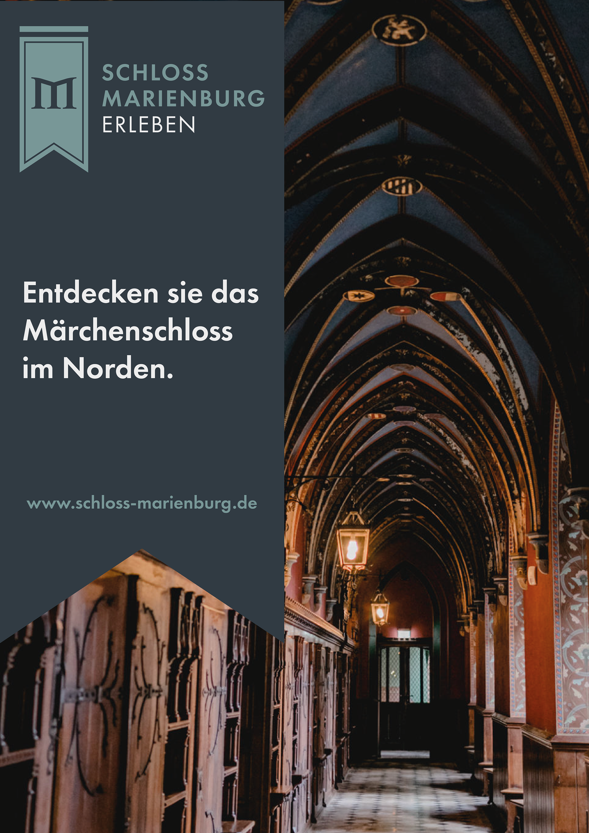
Poster in Location Colors focused on the Castle 'Discover the Fairytale-Castle up north'
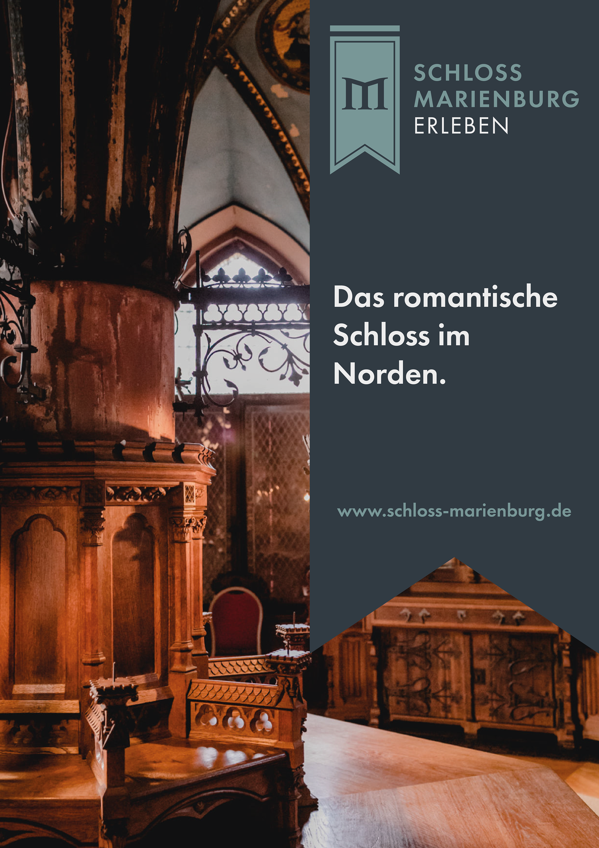
Poster in Location Colors focused on the Castle 'The Romantic Castle up north'
MAKING OF
Here are some pictures of the brainstorming and early drafts before I settled on the final idea.